Friday, 28 June 2013
The Lindisfarne Gospels hit town this week!

Northumbrian Scribes 25th Anniversary celebrations
Saturday 15 June saw Northumbrian Scribes and their guests gather at Bede's World to celebrate 25 years of their society. A grand time was had by all, with lots of activities, calligraphy, nostalgia and refreshments to occupy those present throughout the day.
It didn't take too long for next years Northumbrian Scribes calendars to start flying off the shelves...
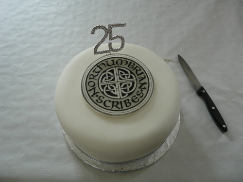
 Judi made a truly wonderful celebration cake...

 Teams were locked in tense competition during the activities, ably marshalled by Mike and Mary...

 The obligatory raffle threw up some nice surprises....
 And some magnificent calligraphy was on show, including pieces for our 25th Anniversary book...
 A new annual award, exquisitely produced by President Tom Fleming, was presented to Tim (by Tom) in recognition of his studies on the Calligraphy with Design course at Kensington Palace.
 Well done all you Northumbrian Scribes...here's to the next 25 years!
It didn't take too long for next years Northumbrian Scribes calendars to start flying off the shelves...



Sunday, 7 October 2012
Foundation Degree in Calligraphy Year 2 Term 1 Week #1
Back after a very long summer break and after an outline of the year ahead it's straight back into a revision of some of the letterforms we have previously studied. This is to set us up for three assignments this term; an exercise in developing an individual script; a miniature capital letter using gilding and vellum, and a larger, more complex piece using a variety of the skills we have learned and developed during our first year.
 During our first session we are working on assignment 2, in which we will be painting a miniature capital letter on stretched vellum, illustrating it and using gold and gesso during the process. This is a completely new experience in many ways for me. Although I have done some heraldic painting before this is not the part that troubles me, but the application of gold and gesso and working on vellum. Hey ho.... lots to learn! We make trials of various substances that can be used in gilding; gum ammoniac, miniatum and other gold sizes.


I'm recording the results in my notebook as we do the tests, and this research will be submitted with my course work as part of this assignment and as part of my second (and final) years work.


Tuesday, 27 March 2012
Foundation Degree in Calligraphy / Term 3 week #1
The first session with Italics. Our tutor is Gaynor Goffe, an absolute master of this and many other hands. What a privilege we all feel....five of us getting almost individual attention from one of the world's leading exponents....truly awesome! Here are some of my stumbling first steps.... When asked by Gaynor if any of us had done any italics before, I rather foolishly replied that I had done a little bit. Whereupon she asked me to write out some lines in 'my italic'. Later on in the day, after some intense teaching and lots of practice, I was able to compare what I had done with my earlier attempts....what a laugh!
Nathalie gets some one to one from the maestro.... Monoline letters before getting into some continuous writing in different nib sizes.
 Preparation sheets for a historical script analysis.
 Four different lines from four different students...!
 When asked by Gaynor if any of us had done any italics before, I rather foolishly replied that I had done a little bit. Whereupon she asked me to write out some lines in 'my italic'. Later on in the day, after some intense teaching and lots of practice, I was able to compare what I had done with my earlier attempts....what a laugh!
Nathalie gets some one to one from the maestro....
 Monoline letters before getting into some continuous writing in different nib sizes.
 Preparation sheets for a historical script analysis.
 Four different lines from four different students...!
Sunday, 25 March 2012
Foundation Degree in Calligraphy / Term 3 week #1
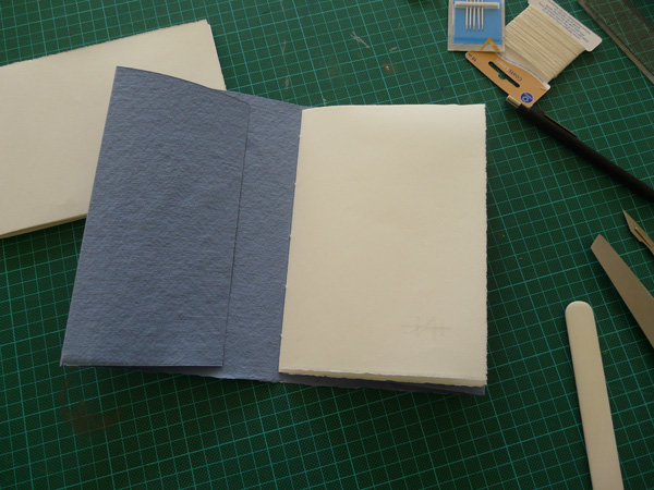
We've started a new term, which will be the final term of the first year! We will be studying bookbinding with Sharon Shaw and also Italics with Gaynor Goffe. I've been looking forward to this term very much, and after our first session I am sure we are going to learn lots and have a great time doing it. We started by making three books in the first session! Here Sharon shows how it's done, folding the sections and sewing them into the covers. Here are my efforts, which I thoroughly enjoyed making. Only one real botch up, so I'll repeat one of the books during the Easter holiday.


 We started by making three books in the first session! Here Sharon shows how it's done, folding the sections and sewing them into the covers. Here are my efforts, which I thoroughly enjoyed making. Only one real botch up, so I'll repeat one of the books during the Easter holiday.
Sunday, 18 December 2011
Foundation Degree in Calligraphy / week #13
So, as planned this week we went to The V & A to study a painting in order to evaluate colour content and proportion. After a short tour around the Indian gallery, and an introduction to the project, we set to with a picture of our choice. Here's the one I chose...


Sunday, 11 December 2011
Foundation Degree in Calligraphy / week #12

 Following our first venture into colour exploration, we are using 'saturation of hue' to evaluate colour percentages in an image. As if that weren't a difficult enough task for a duffer like me to grasp, there is no 'image' but we have to apply these theoretical gymnastics to a piece of prose!
 This is challenging in the extreme to me... but amazingly I come up with something that I am mildly pleased with, and more importantly, seems to please my tutor. From here we will be going to The Victoria & Albert Museum to repeat this process with an actual picture... this is what is commonly known as 'taking it to a whole other level'.
Sunday, 4 December 2011
Foundation Degree in Calligraphy / week #11
 A new term starts, and we are studying colour as part of our second module; 'Language of Calligraphy and Design'. Hazel takes us through some basic colour preparation and instruction, and then its time to mix paint!
 I realise quite early into the session that colour is my achilles heel... a weak point whenever I approach a design project. I think I rather arbitrarily 'choose' a colour that I 'like', rather than thinking through the reasons and objectives of the project and selecting colour as a contributory element of the whole thing.
 Apart from learning about colour and how to use/apply it, we are making colour swatches in gouache so that when we study individual paintings later on, we can match the colours we see and reference them against our samples.
 We're learning about Saturation, Hue and Value, and we prepare colour mixes to demmonstrate various combinations of these aspects. It's amazing how differently we all approach this, even though we are using the same basic pallette.

 For homework we'll be attempting to produce images that repesent colour percentage values in a piece of descriptive prose. This will be a real challenge for me. Thankfully I have some good reference from Paul Klee to help me along!


Sunday, 27 November 2011
Foundation Degree in Calligraphy / week #10
I've been fininishing off my assignments this week and gathering all my final pieces together in readiness for submission next week. The Roman Capitals... The Foundational Hand...
 My research book...


 And the Monoline Roman Capitals and Miniscules, presented in two small concertina books...


 The Foundational Hand...
 My research book...


 And the Monoline Roman Capitals and Miniscules, presented in two small concertina books...


Sunday, 20 November 2011
Foundation Degree in Calligraphy / week #9
Full steam ahead now with the Foundational text for this element of my assignment. The content is chosen and I've worked out the nib size, line spacing and layout, although I may change this later. I've made some notes to refer to as I write, and I'm always aware of the particular letters that continue to give me problems, including that pesky 'l'.
 So... a few exercises to try and stamp out that stupid letter that I seem to have a mental block with....mmmm... that seems better, wonder how long it will last!
 Other students are working on various tasks. Here Nathalie dampens a line on a sheet of paper to experiment in developing a decal edge.
 Meanwhile...I have been writing my text out in chisel pencil. I've decided to change the layout a bit and I'm trying the lines out with various indents and line endings to make the most appealing layout.
 I've also made a decision to have a drop capital initial to the beginning of the piece. Again, I try different sizes in pencil only, and separate the top line of the text to see how that could work together with the initial cap.
 I decide on this size for the cap initial and I'm much happier with the layout and particularly the line endings. I think I can get cracking now with the final piece!
 Nathalie is busy preparing her Foundational piece too, working out the layout with strips of writing and placing them on a sheet of cartridge paper to get the position of each line just right.

 So... a few exercises to try and stamp out that stupid letter that I seem to have a mental block with....mmmm... that seems better, wonder how long it will last!
 Other students are working on various tasks. Here Nathalie dampens a line on a sheet of paper to experiment in developing a decal edge.
 Meanwhile...I have been writing my text out in chisel pencil. I've decided to change the layout a bit and I'm trying the lines out with various indents and line endings to make the most appealing layout.
 I've also made a decision to have a drop capital initial to the beginning of the piece. Again, I try different sizes in pencil only, and separate the top line of the text to see how that could work together with the initial cap.
 I decide on this size for the cap initial and I'm much happier with the layout and particularly the line endings. I think I can get cracking now with the final piece!
 Nathalie is busy preparing her Foundational piece too, working out the layout with strips of writing and placing them on a sheet of cartridge paper to get the position of each line just right.
Subscribe to:
Posts (Atom)