When asked by Gaynor if any of us had done any italics before, I rather foolishly replied that I had done a little bit. Whereupon she asked me to write out some lines in 'my italic'. Later on in the day, after some intense teaching and lots of practice, I was able to compare what I had done with my earlier attempts....what a laugh!
 Monoline letters before getting into some continuous writing in different nib sizes.
 Preparation sheets for a historical script analysis.
 Four different lines from four different students...!
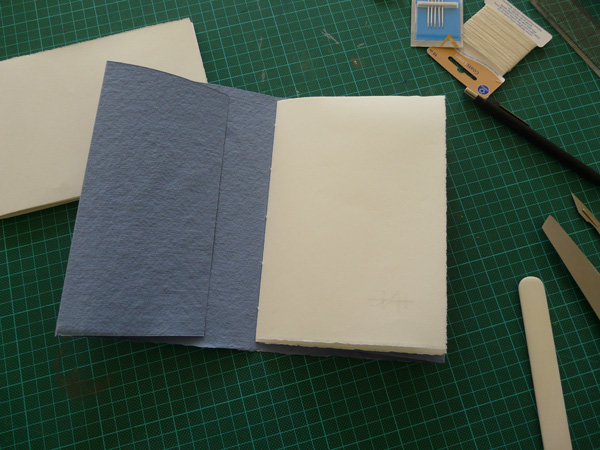
 We started by making three books in the first session! Here Sharon shows how it's done, folding the sections and sewing them into the covers. Here are my efforts, which I thoroughly enjoyed making. Only one real botch up, so I'll repeat one of the books during the Easter holiday.


 Following our first venture into colour exploration, we are using 'saturation of hue' to evaluate colour percentages in an image. As if that weren't a difficult enough task for a duffer like me to grasp, there is no 'image' but we have to apply these theoretical gymnastics to a piece of prose!
 This is challenging in the extreme to me... but amazingly I come up with something that I am mildly pleased with, and more importantly, seems to please my tutor. From here we will be going to The Victoria & Albert Museum to repeat this process with an actual picture... this is what is commonly known as 'taking it to a whole other level'.
 A new term starts, and we are studying colour as part of our second module; 'Language of Calligraphy and Design'. Hazel takes us through some basic colour preparation and instruction, and then its time to mix paint!
 I realise quite early into the session that colour is my achilles heel... a weak point whenever I approach a design project. I think I rather arbitrarily 'choose' a colour that I 'like', rather than thinking through the reasons and objectives of the project and selecting colour as a contributory element of the whole thing.
 Apart from learning about colour and how to use/apply it, we are making colour swatches in gouache so that when we study individual paintings later on, we can match the colours we see and reference them against our samples.
 We're learning about Saturation, Hue and Value, and we prepare colour mixes to demmonstrate various combinations of these aspects. It's amazing how differently we all approach this, even though we are using the same basic pallette.

 For homework we'll be attempting to produce images that repesent colour percentage values in a piece of descriptive prose. This will be a real challenge for me. Thankfully I have some good reference from Paul Klee to help me along!


 The Foundational Hand...
 My research book...


 And the Monoline Roman Capitals and Miniscules, presented in two small concertina books...